GRINNELL, Iowa – The Midwest Conference (MWC) is proud to announce a refreshed brand identity, developed in partnership with a full range of conference stakeholders. Beginning in January 2022, the conference set out to evaluate the status of its existing identity and reimagine how its story could be told in an exciting and meaningful way. The creative process was guided by New Jersey-based Skye Design Studios (SDS), a national leader in sport branding.
“As a league that has endured for over 100 years and remains true to its original mission, the Midwest Conference sought to modernize its logo while honoring its past,” said MWC Executive Director Heather Benning. “The outcome of this process is an updated mark that is more dynamic in color and intentional in style than our previous logo.”
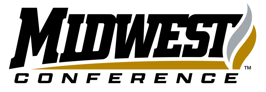
The new identity builds on the visual equity of the historic conference marks, retaining the flame and general layout, but evolving it to a contemporary style while simultaneously integrating the three following brand narrative storylines which capture the ethos of the conference:
Midwest Horizons: The letters in the core marks are shown rising from a horizon line. This concept alludes to both the opportunity offered by the conference as well as the distant landscapes associated with gameday travel among membership.
Eternal Flame: A gold and silver eternal flame is positioned on the right side of the core marks to pay tribute to the enduring legacy of the conference – established in 1921 – and also represent its academic prestige and excellence.
Unified Lettering: The letters in the core marks are intentionally unified, symbolic of the camaraderie, connectivity, and diversity and inclusion of the conference.
“As we went through the process of creating a new mark, we wanted a visual representation of our commitment to academic excellence and the prospect of providing unique opportunities as an intersection of higher education and athletics,” said MWC Assistant Executive Director Chassidy Holloway. “I hope the mark serves as a reminder to our member institutions and student-athletes of our shared common ground as a league, and that they are inspired to continue to strive toward the highest ideals of academic and athletic achievement.”
The brand package includes three core marks, sport-specific marks, and postseason marks to give the conference flexibility for specific applications.
“My favorite part of the creative process is always the collaborative nature of creating something new together,” said SDS Founder Skye Dillon. “The final identity is truly a reflection of the collective conference voice, and I’d like to thank Heather and Chassidy at the conference office for their leadership throughout.”
For more information about the Midwest Conference brand update, contact Assistant Executive Director Chassidy Holloway at holloway@midwestconference.org.
***Story and logo courtesy of Midwest Conference***